

Check:
Headline readable
Buttons full-width
Sections not cramped
Images not awkwardly cropped
Fonts not tiny
Form is easy to tap
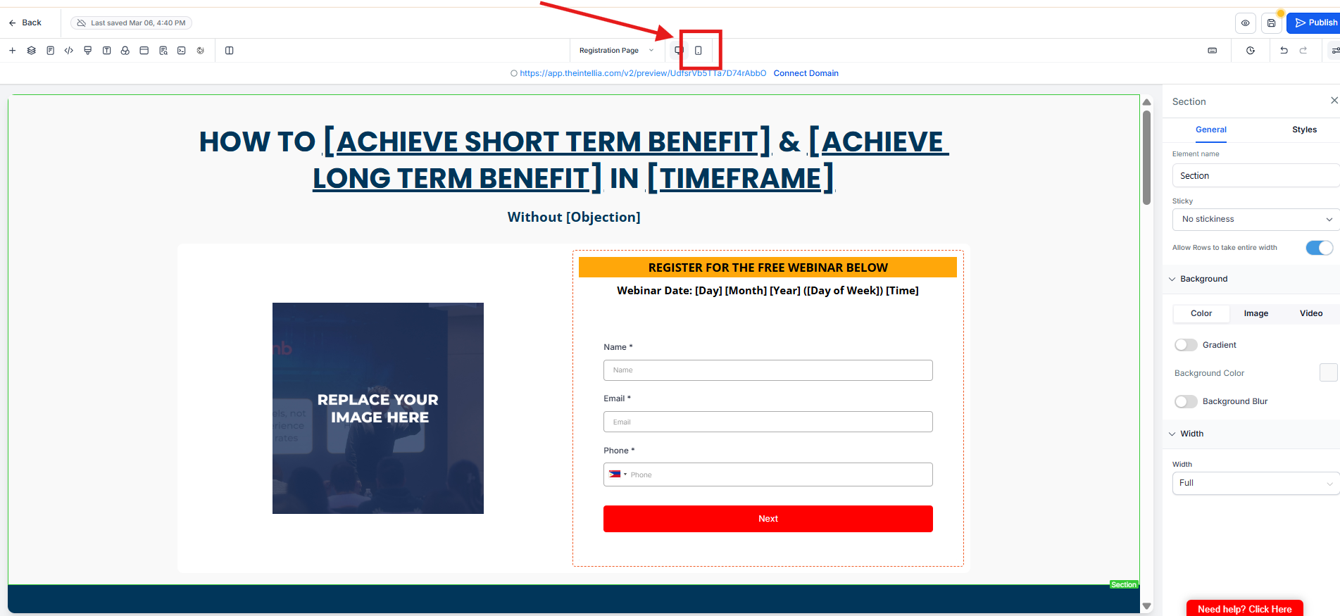
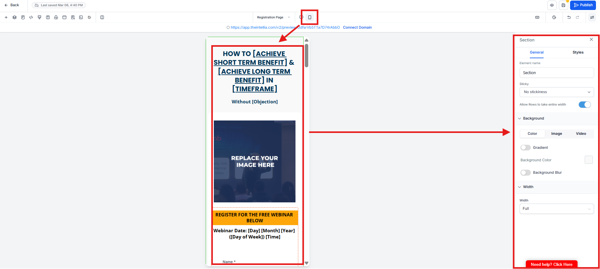
✅ Tip: Use padding, not spacers.
Frequently Asked Questions
Why is mobile optimization mandatory?
Most visitors view your page on mobile. If it’s hard to read or tap, conversions drop—even if desktop looks perfect.What should I check first on mobile?
Start with headline readability and CTA buttons. If the headline is hard to read or buttons aren’t full-width, fix those first.Why should buttons be full-width on mobile?
Full-width buttons are easier to tap and reduce missed clicks or user frustration.My page looks cramped—what should I adjust?
Use padding and margin settings, not extra spacers. Spacers often break layouts on mobile.What’s a common mobile mistake to avoid?
Leaving fonts too small or images awkwardly cropped. If it looks messy, simplify—mobile clarity beats visual flair.